Essential Website Features for Medical Practices
The most important feature that any medical practice should have on their website is a strong User Experience.
This means, from the time a patient enters your website, here are the questions you should consider…
- what are they doing,
- how are they doing it,
- how long does it take, and
- is it easy to do?
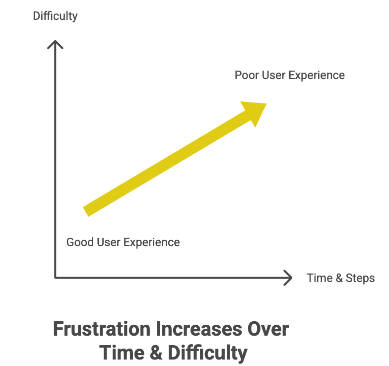
Here is a graph to help illustrate how we should think about these 4 things.
Below I’ll give two examples of a bad and a good user experience, and then we’ll discuss ways to turn a bad user experience into a good one.
A strong customer experience
Creating a strong user experience means simplifying the things needed to be done, removing hoops, and shortening the time between now and the payoff.
Here are 2 examples:
Example 1: A poor User Experience example
let’s take a ENT office that has a functioning website. The goal is for new patients to register with the clinic, and for returning patients to easily register for an appointment.
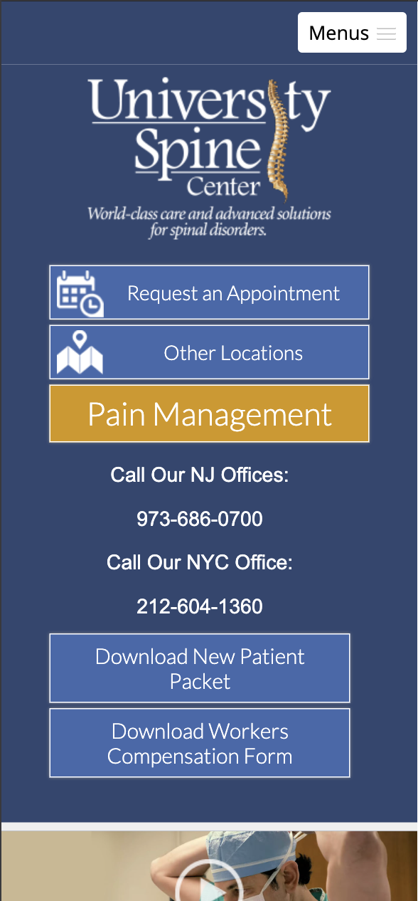
But, the interface is blocky, old, very slow, and difficult to read on mobile devices. “Do I click on this button or that?”. Any time you make it difficult for you user to make a decision, you are losing patients and losing revenue.
In the example below, it’s not clear what the interface is telling us to do.
Example 2: A great User Experience example
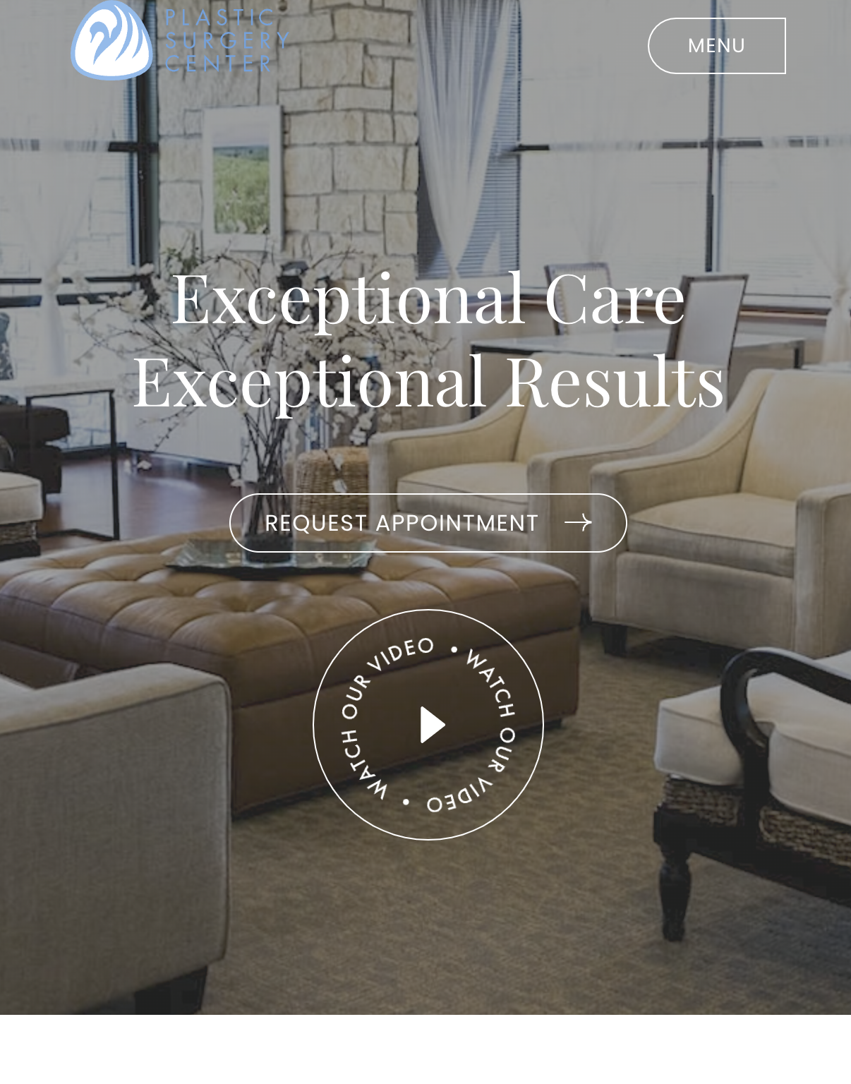
Let’s take the same ENT office. But now their website is lightning fast. The website loads immediately with clear and short instructions on how to book an appointment. The button they click takes you to your scheduling software and after selecting your schedule time, you’re all set to go. Quick and painless. As it should be.
An Easy to Use Patient Portal Integration
You likely already have a patient portal. If you do, the next question is, how easy is it for patients to register for an appointment?
Count the number of steps required for someone to go from entering your website, to booking an appointment. This number should be as low as possible, If it is not, think about what steps you can cut or at least remove from the initial sign up / registration process. anything that removes steps will make patients feel at ease and more willing to book with you.
Responsive & Mobile-First Design
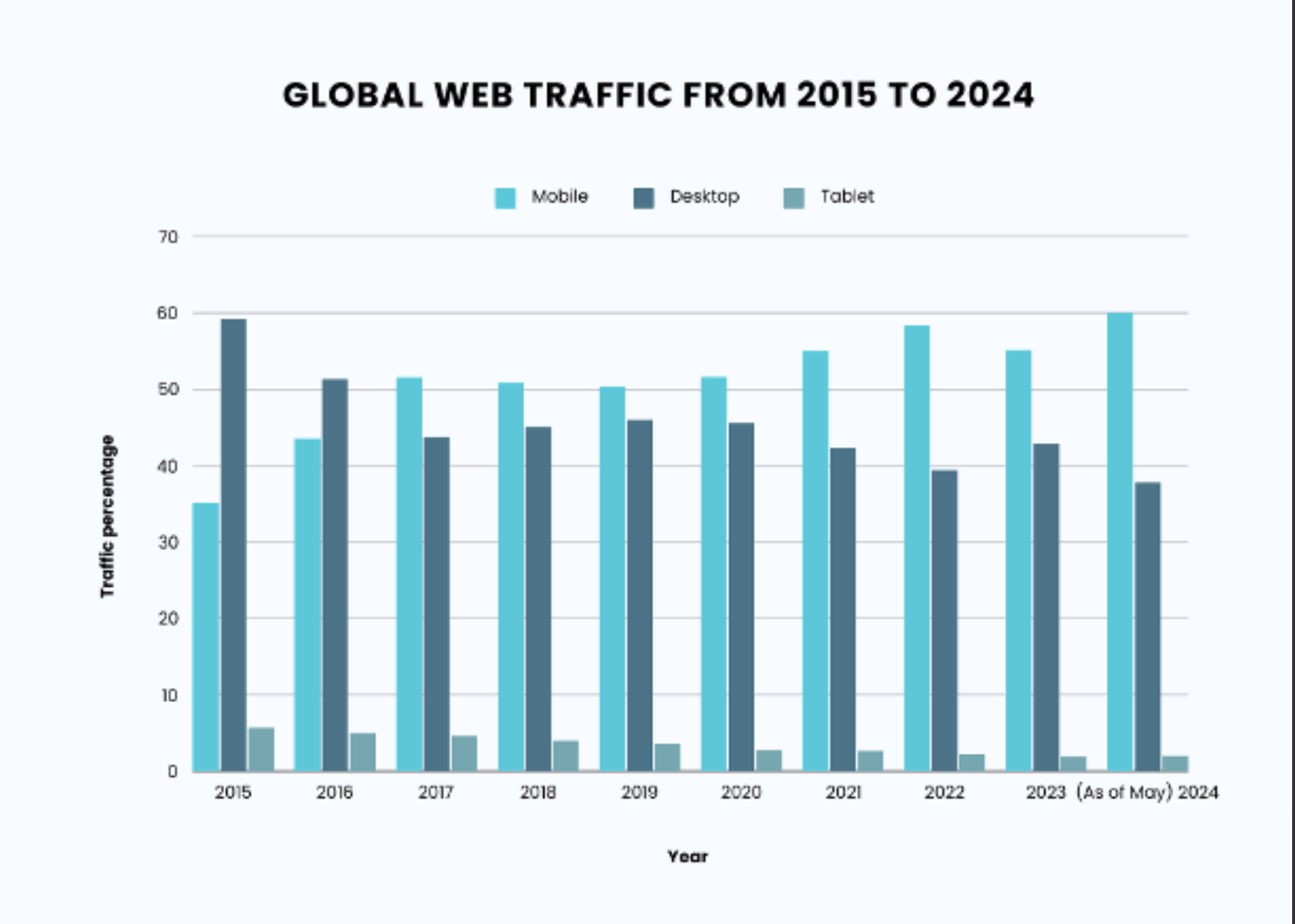
Since 2015, global web traffic on cellphones has increased from 35% to 60% of all web traffic. So 6 out of 10 people are browsing the web using their smartphones. Not their laptops.
So, when you’re web designer comes to you with a new website design, you say, “ok, but let’s start with the mobile layout”.
Here are some elements that your mobile website layout should have.
Source: Indectron
A mobile first design and code
Most developers make their websites for desktops before even thinking about mobile devices. This has the unfortunate affect of making the mobile experience slow and ugly.
Your mobile layout should be the priority! Yes, in part because most traffic is mobile now, but also because a mobile screen is very different in terms of how information is organized. Web designers who understand this make sure the mobile layout is just as good or better than the desktop counterpart.
Correct sizing for mobile devices
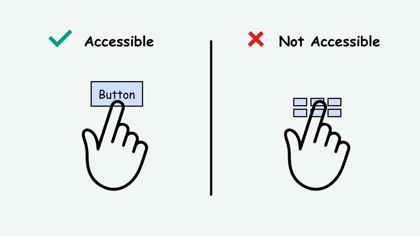
Buttons and links need to be at least 48 x 48 pixels to avoid accidentally pressing the wrong button or link. Make sure the font size you use is at least 16pixels. These are small details, but they make a difference for users who have poor vision or have trouble pressing small buttons.
source: Accessguide.io
How does your website speed compare on Mobile?
You should check your website’s mobile speed score in relation to the desktop score. It’s easy to do. Go to this link and type in your website name. Make sure there is less than a 20 point speed difference between your desktop and mobile layouts.
Avoid Wordpress, Opt for Hand Coded Websites
Wordpess is a well established website development platform that most non-web designers will know about. 30% of the web is made with Wordpress, despite the plethora of security issues it has.
Wordpress is like a bunch of lego blocks called “plugins” stacked together to give your website different capabilities. Except these plugins tend to have small doors where hackers can enter. Web designers do their best to lock these doors, but plugins make up 93% of a Wordpress website’s vulnerabilities.
If there is any sensitive data at all on your website, the best option is to choose a hand coded site that is statically served. What does this mean?
For security use a pre-rendered website
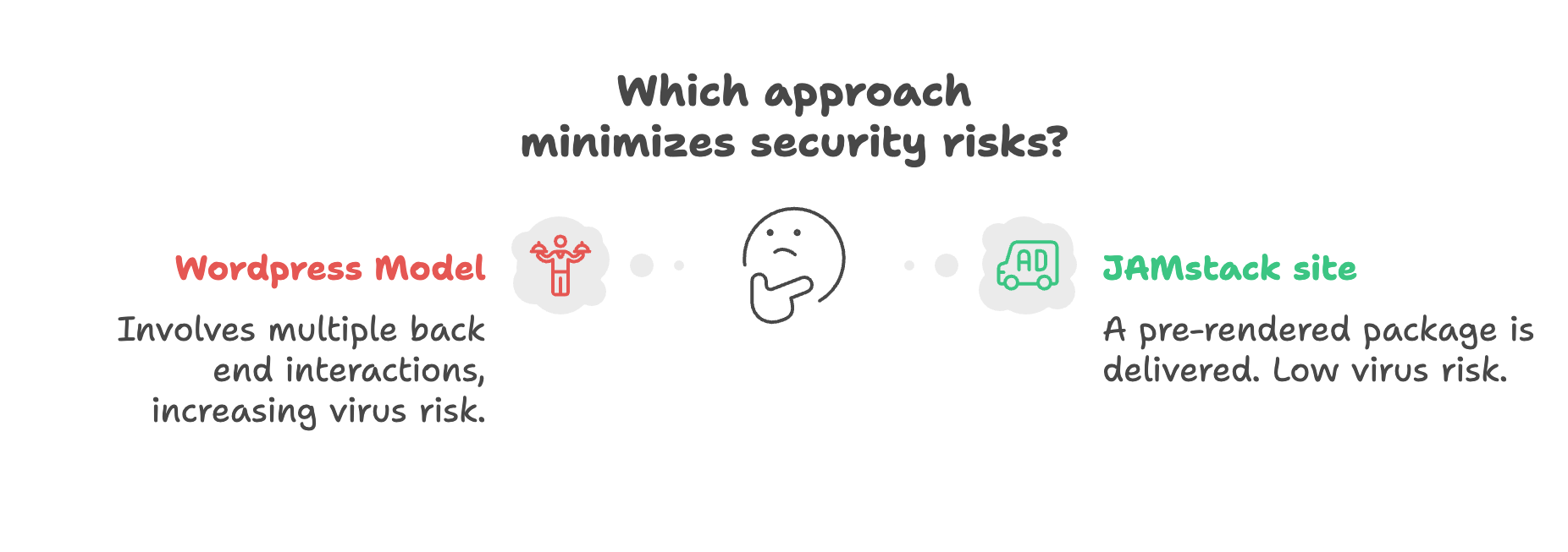
Pre-rendered websites (also known as JAMstack) are seeing wide adoption by major companies like the CIA and National Geographic. What makes them special? Think about the difference between eating at a restaurant (Wordpress) and an Amazon delivery (Solstice Websites).
At a restaurant, any time you want something on the menu, you need to tell the waitress. Then she goes to the kitchen, lets the cooks know, and comes back when your order is ready. The issue is that you could be carrying a virus, that could stick to the waitress, and infect the kitchen (your back end system)!
Amazon packages are delivered with everything included. Once you get it, there’s no more communication with Amazon. No contact, no issues with viruses. So, if you are concerned with security, avoid Wordpress and opt for a hand coded site that is statically served.
For speed, avoid website builders
Slow websites should be avoided because they cause…
- People to leave your site before it loads
- Lower search engine rankings
- Feeling of a poor customer experience
Website builders like Wix and Squarespace are easy to use, but they slow down your site to the point that people will exit before the page even loads. For a small personal blog this might work, but professional clinics can do so much better.
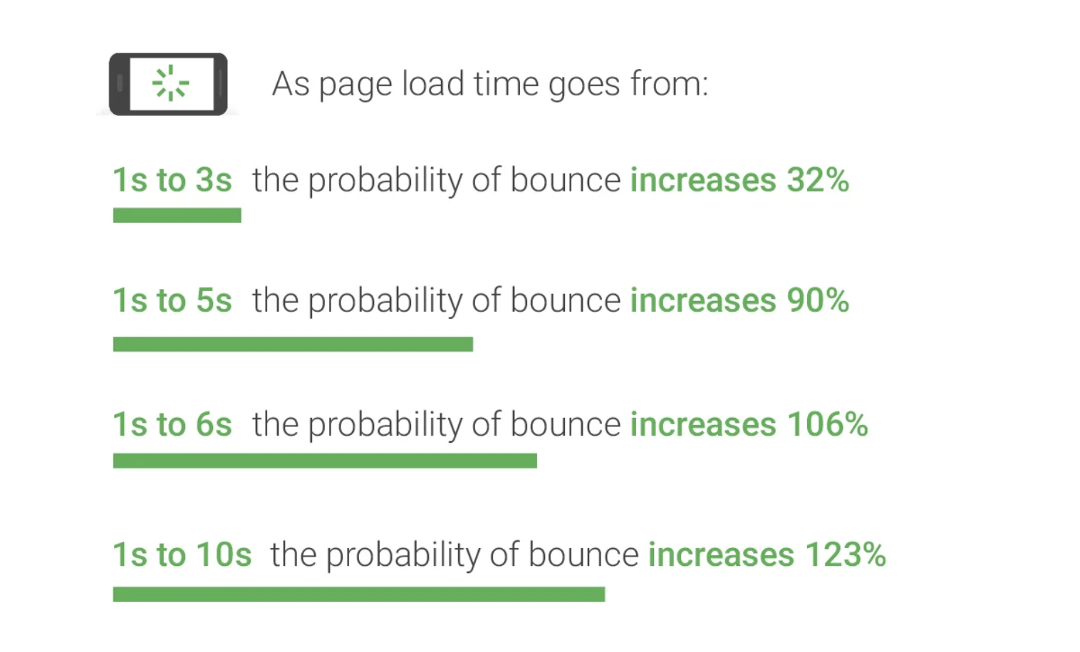
Google research showed in 2018 that load times that increase from 1 second to 3 seconds cause a 32% increase in the number of people who bounce (quickly leave the website).
Wix and Squarespace can get marginally faster, but only if you pay extra. Wordpess can be quick, but not even the best web developers are able to make it faster than a hand coded site.
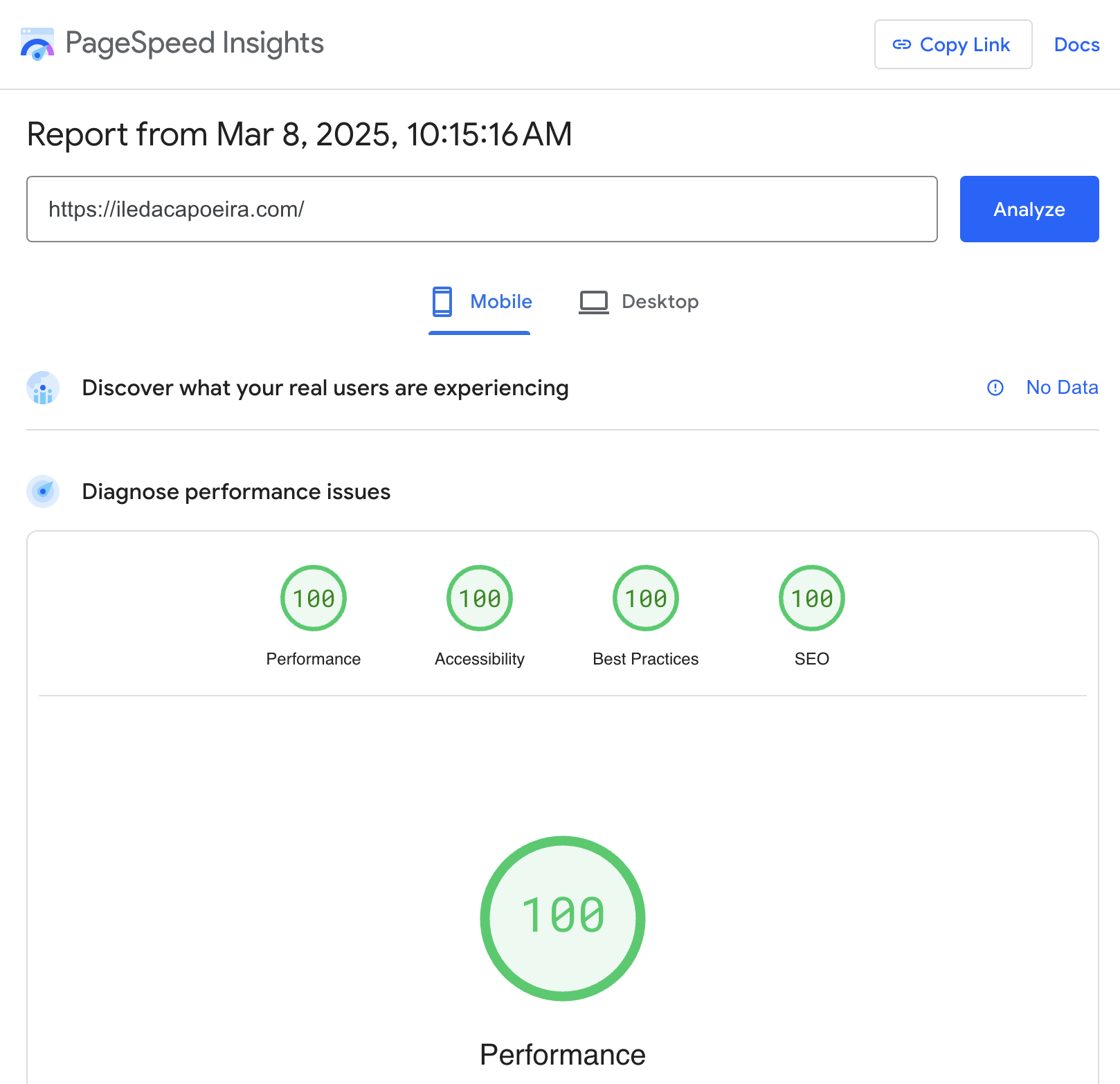
Out of the box, Solstice Websites are blazingly fast with Google Speed Scores of over 93+ being the norm. But the best part is that most websites load within a second (1 second), which visitors will notice.
Here is an example on March 8, 2025 of a website completed recently. 100 score on Google Page Speed Insights. Excellent!
Your Design is “Good” if The Message is Clear
Building a strong user experience means organizing your website in a way that information and actions are easy to do. All too often, website owners want to showcase a little bit of everything. My clinic does emergency surgery, we use the same technology used by Tiger Wood’s surgeon, etc. All these facts mean squat to a customer.
Your website visitors know what you do, and if they don’t they can scroll down the page to learn. But step one is guiding your prospective patients to schedule an appointment or a consultation. that should be the first thing people see when entering your website.
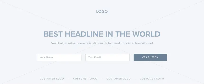
The second thing people should see are all the amazing things you do and the testimonials of past patients. Testimonials are similar to referrals in the eyes of a consumer, so having a few means people will are more likely to schedule with you.
Lastly, you want to make sure you have a clear list of services in your home page with links to a page that describes that specific service. If the visitor wants to learn more, they can click on the link and learn about how that service works.
How can I evaluate my medical clinic site?
The best way to evaluate your clinic’s website is to have an audit performed. Solstice provides audits and strategy calls for customers looking to evaluate their website’s performance, and see how they can improve it.